Showing posts with label trends. Show all posts

April 11, 2013

Working with Emerald for Spring

It is officially Spring and true to Calgary weather we experienced some lovely warm days when all the snow melted and then today, as I'm writing this, it's snowing.

Regardless of that though, I'm feeling Spring and was thinking about how Pantone's colour of the year "Emerald" could be used to freshen things up.

Incorporate new artwork
Emerald Forest by Ara133photography via society6
Green by Guido Montanes via society6
London - BT Tower available on Etsy at NigelDK

Add new soft furnishings and textiles
Maxime chair in green velvet by Jonathan Adler
Paulina Reyes silk bird pillow available at West Elm
Daisy Garden Rug by Joe Jin (one of my super talented friends)

Accessorize
A collection of emerald green vases on Etsy at A New Day Vintage
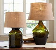
Clift Glass Table Lamp available at Pottery Barn - love that Style at Home picked the same lamps
Moss terrarium available at Indigo

January 27, 2013

Trends for 2013

There are some really great trends predicted for 2013.  I love poring through the January shelter magazines and seeing what's expected in the upcoming year.  Some of my faves include:

Brass
Seriously, I did not think I would be a fan of this trend but seeing it take form in some lovely light fixtures has persuaded me to want to try it.
Rowan Pharmacy Task Floor Lamp - Antique Brass - Restoration Hardware
Computer generated photo-realist fabrics
This trend is easily added through the use of pillows and I've already seen it appear in several shops.
Woodtype Cushion - by LazySuzan on Etsy
High-gloss
Looks fantastic in brightly saturated hues.
Latitude Slate Blue/Grey Low Dresser - CB2
Emerald
It's the Pantone colour of the year so you'll start seeing it everywhere!
Emerald Toile Solomon's Seal - Chintz & Company
Materials that look vintage
Think slate, weathered concrete and crackle-glazed tiles
Emser Tile - Cristallo Crackle Willow Green - South Cypress


December 09, 2012

Pantone Colour for 2013 is....

Emerald
I was wowed by last year's Tangerine Tango, although I would only use it as an accent. I'm just not sure yet what I feel about this version of Emerald.  I think I like it a little deeper - add a bit of black to make the colour murkier.  This version though will probably feel fresher for the Spring and Summer as the darker jewel tones seem better suited for Fall and Winter.  It'll be interesting to see how this colour is interpreted in home decor in the upcoming year. 

January 06, 2012

Trends for 2012

There are a lot of trends published in various shelter magazines and other blogs for 2012.  Trends in home decor seem to be swayed by fashion (colour trends, fabric choices) and various social influences (shift towards to sustainability, upcycling).  One difference is that decor trends tend to have a longer lifespan as most consumers can't decorate their homes on an annual or seasonal basis (like many of us update our closets).  Here are a few that have caught my eye:

Weathered Kitchens - think rough-hewn cabinets and re-claimed wood which is great for a cabin or cottage
via The Weathered Bungalow
via Country Living

Zigzag or Hexagon Patterns - similar (and at times indistinguishable) to the chevron trend of last year.  Geometric patterns are wonderfully graphic and so easy to find at lots of price points

Available from Baffin Bags through Etsy 

Maze rug via Chiasso

Industrial Salvage and Refined Industrial - I have loved this style since it first cropped up a few years ago and each year it seems to be tweaked slightly and continues to feel fresh

Beautiful "industrial" armoire from Hardware Interiors
Smash in Toronto is a great spot to search for industrial pieces and Hardware Interiors definitely has the refined industrial trend covered with their latest collection.

Subway Tiles - what's new is that subway tile is being extended to the ceiling or throughout a space and in some instances in bold hues.  I've also seen a few instances of white tile with a dark grey grout that really makes it stand out rather than fade into the background if it's all white.

via House and Home
via Casa Cullen
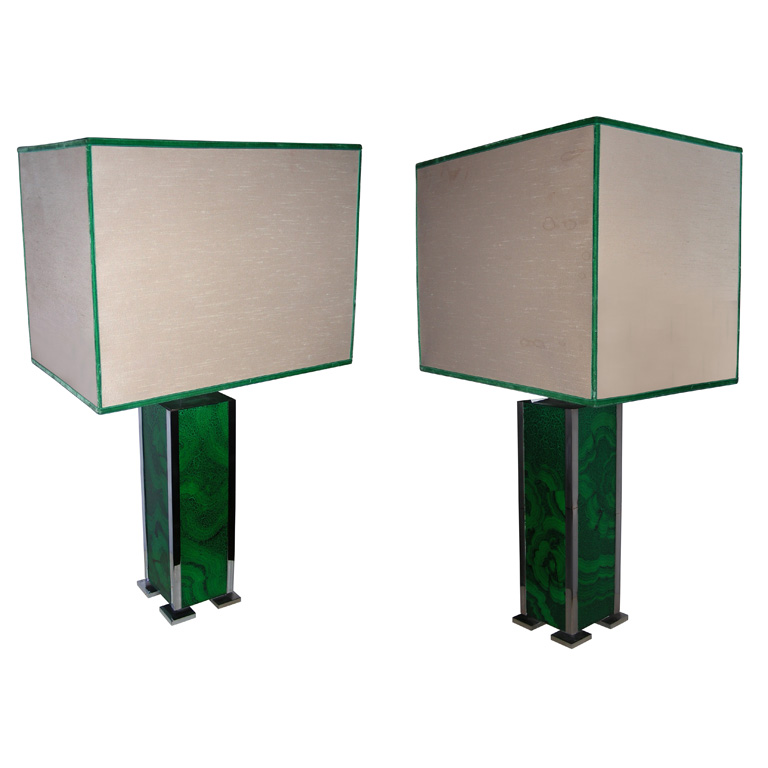
Malachite - Malachite is an intensely green-coloured mineral and is probably best in small doses
Malachite lamps from 1st Dibs
Water-coloured Wallpaper - adds a subtle hit to a wall and is probably an easier commitment than some of the bold or flocked versions that were popular last year

Kreme Life Muse collection
Oversized Light Fixtures - a great way to add impact to a small space


via Houzz

January 02, 2012

Trends for 2012 - Colour Part II

This is the month when all the shelter magazines come out with their colour trends for the upcoming year (January editions).  There are similarities to what is also predicted by the paint companies but a few standouts include: 

Heathered grey - designers love using grey and this one adds a lovely depth and surprisingly a warmth to a space

Down Pipe No. 26 - Farrow & Ball
via Style at Home
Acid yellow - a similar yellow looked fantastic in the 2011 Princess Margaret Showhome's dream country kitchen

Olive Chartreuse 6102-54 - Sico
via House and Home

Raspberry red - great as an accent
Rum Punch 231-7 - PPG Pittsburgh Paints
Raspberry throw via Carnaby Home

Deep blue - a touch of classic Wedgewood blue and works well with the chinoiserie trend
Chinese Porcelain 449-6, PPG Pittsburgh Paints

Elte's Second Life Rug

Pantone proclaimed that Tangerine Tango 17-1463TCX was the colour of 2012 - I like it but probably only as an accent colour.  I think it would look fantastic with a deep navy or a grey to tone it down.  It's expected to be a hot colour for Spring in the fashion world so we'll see how that carries into fabrics and then translated into cushions, bedding, rugs, accessories, etc.


See House and Home and Style at Home for articles on the 2012 paint trends.

January 01, 2012

Trends for 2012 - Colour Part I

Most of the paint companies have published their 2012 colour trends.  I personally paint with either Benjamin Moore or Behr and find both websites fantastic for inspiration.  Here is a sample of some of their trends and a few other paint companies with links to the articles and galleries on their sites.

Benjamin Moore - Colour Trends 2012
BM has proclaimed "Whythe Blue HC-143" as the colour of 2012. I like it - blue and grey are my two favourite colours and with a touch of green in the mix, it feels quite moody and rich.

Whythe Blue HC-143
BM has classified their 2012 trends into four vignettes - Earth and Sky, Eclectic Elegance, Spiced Life and Sense and Sensibility.

Earth and Sky - Whythe Blue, Storm Cloud 2140-40, Battenberg AF-70, Fresh Olive 2149-30, Sharkskin 2139-30

Eclectic Elegance - Farm Fresh AF-360, Nimbus Gray 2131-50, White Dove OC-17, Gypsy Love 2085-30, Stardust 2108-40

Spiced Life - Amethyst Shadow OC-930, Persimmon 2088-40, Refined AF-75, Revere Pewter HC-172, French Press AF-170

Sense and Sensibility - Montpelier AF-555, Pashmina AF-100, Dunmore Cream HC-29, Masada AF-220, Ballet White OC-9

Behr - Color Trends 2012
Behr has also classified their trends into four categories:  Santa Fe Today, Retro Recall, Safari Escape and Tea Party.  The first two aren't quite my style but Safari Escape is full of grey tones (which I love) and Tea Party is just saccharine and sweet - perfect for a small space (think office, powder room or a little girl's room).

Safari Escape - Compass T12-11, Tribal Drum T12-12, Serengeti Dust T12-15, Jackal T12-12, Livingstone T12-14
Tea Party - Sugar Pool T12-19, Queen's Tart T12-16, Minty Frosting T12-18, First Peach T12-20, Violet Water T12-17
Para Paints - 2012 Trends
At Para, they actually had various designers provide their input on the colour trends for 2012.  My personal fave was "Urbanage" by Ambrose Price.

Urbanage - Soft lavender P5237-34, Leaning Tower of Pisa P516-34D, Tribeca Square P5207-34, Cityscape P5219-62, Lunch at Tiffany's P5219-24, Little Black Dress P5195-85, Ravished P5141-85, Yahoo P5181-24D
Other styles were Digital by Glenn Dixon, Rhythm by Marc Atiyolil and Inhale by Elizabeth Whernsby.

Sico - 2012-2013 Colour Trends
Sico have broken down the trends into three colour themes:

Ming Red 6052-65, Pinto Bean 6078-31
Blue Charm - 6023-52
Marjoram 6141-31, Inscrutable Sky 6176-83
Nambian Desert 6142-74, Diaphanous Sky 6176-21
Mourning Dove 6183-31, White Goose Down 6183-11
Burnished Clay 6066-63, Eskimo 6181-31

Farrow & Ball
F&B  introduce their colour trends in February but they have shared a preview with various shelter magazines.  I find their colours suit a certain aesthetic as their paints are made with a clay component and therefore have an underlying grey base.

Brassica No. 217 (walls), Stone Blue No. 86, Manor House Gray No. 265, Comforth White No, 228