The project involved a lot of drawings - floor plan and furniture layout, window wall elevations, drawings of the upholstered pieces to scale plus a perspective drawing which would detail our bedding choices. Using discontinued fabric samples from our instructor and my fabric fundamentals class, I was able to create a calming space and layered various creams and blues throughout the design.
Showing posts with label school. Show all posts
March 21, 2012
Window Treatments and Soft Furnishings
I just completed one of my courses last week and thought I would share my sample board. The final project was to design a bedroom for a couple living in a traditional home but open to moving towards a more contemporary design aesthetic. The room had one window and we needed to design a treatment that would block out light at night but wouldn't impede upon a radiator that was directly below the window (I designed a screened-in cover to hide the rad). We also needed to design an upholstered headboard, bedding and an upholstered chair or bench.
The project involved a lot of drawings - floor plan and furniture layout, window wall elevations, drawings of the upholstered pieces to scale plus a perspective drawing which would detail our bedding choices. Using discontinued fabric samples from our instructor and my fabric fundamentals class, I was able to create a calming space and layered various creams and blues throughout the design.
March 18, 2012
Fabric Fundamentals - Part II
Since this is a "fabric" class, the real focus of our design relates to the fabrics we choose. We need to determine the characteristics of each selection to determine if it will work for the chosen application, as well as the aesthetic features of each choice. For example, my client profile is a family with kids and pets. I'm obviously looking for something that's durable and can easily be cleaned but that is also soft and comfortable with fun patterns and colours to suit their personality.
Here is a snapshot of my pile of fabrics to choose from:
And here is a shot of my final choices - I don't even want to try and calculate how many hours it took to get to this:
Here is a snapshot of my pile of fabrics to choose from:
And here is a shot of my final choices - I don't even want to try and calculate how many hours it took to get to this:
Here is my actual sample board bringing together my fabric and furniture selections:
![]() |
| Photo isn't great as laptop and camera are not currently speaking to each other |
There were a few changes made based on my first post as sometimes you just need to see the pieces laid out to see if they actually "feel right". I'm really happy with how it's come together and we shall see later this week what the rest of my class thinks.
March 17, 2012
Fabric Fundamentals - Part I
My last class of the semester is next week and we are presenting our final design boards. We were able to select from eight different client profiles and each profile included the size of the room, brief description of the client and then a listing of the type of furniture and style desired for the space. I love this approach as it allows you to pick a profile that perhaps mimics your own aesthetic.
I decided on the following client profile:
Not a lot of information to go on, so I've taken the liberty of injecting some humour into the design and lots of colour. Some pieces I found on-line that I'm hoping to work into the project include:
I love this piece but don't think I can make it work in the room as I need to incorporate an upholstered ottoman/coffee table.
Great piece to sit on top of an upholstered coffee table to keep remote controls, magazines, etc. in one place.
A versatile piece that can be used as a stool and a side table - also comes in black, white and persimmon.
I think these drapery rods are fantastic and would work well in a fun family room and a classic industrial loft.
The accessories at West Elm never disappoint and I love this new terrarium shape. Fun for kids to set up a little green world of their own.
I decided on the following client profile:
- A family room 16' x 18'
- The room contains a sectional sofa, a large arm chair, and a large ottoman which serves as both seating and a coffee table. Two windows in the room overlook a shaded garden.
- Your clients have children and pets. They are looking for a warm and welcoming design.
Not a lot of information to go on, so I've taken the liberty of injecting some humour into the design and lots of colour. Some pieces I found on-line that I'm hoping to work into the project include:
![]() |
| Prairie Coffee Table from Gus Modern - via Modern Karibou |
![]() |
| Ekobo Tivo Bamboo Tray in Tomato - Modern Karibou |
![]() |
| Martini Side Table in Lemon by West Elm |
![]() |
| Industrial Pipe Rods by West Elm |
![]() |
| Glass terrariums by West Elm |
Now that I've selected a few pieces for the room, it's time to start drawing the furniture layout and picking my fabric samples. Update to follow.
January 25, 2012
Cotton bolls instead of flowers
Was walking past Quince Flowers the other day and stopped when I saw these great cotton bolls in the window. They reminded me of my first fabric class last week which focused on fabrics from plant fibers (this week we focused on man-made fibers). I think this look is a great update on the branches in vases we've seen over the past few years.
November 27, 2011
Lighting Inspiration
My final Lighting project involves a two bedroom condo. Our instructor wants us to challenge ourselves with our lighting choices and reminds us that there is no budget! Some fabulously expensive lighting finds I found include:
![]() |
| Artichoke Glass Pendant - Design within Reach |
![]() |
| Wooster Pendant Light - YLighting |
![]() |
| Cadmo Floor Lamp - Artimede |
![]() |
| Leaf Light - Design within Reach |
November 05, 2011
Getting Country-fied
Project 3 for Interior Decorating I involves designing a condo for a client with a specific design style in mind on a $70,000 budget - my partner and I got a single woman with three cats that likes "North American Country" and pastels. She is also a piano teacher and needs a room/space for lessons that is separate from her personal space. We also have to incorporate her piano and a pre-existing hutch (which thankfully can be painted). Definitely a challenge. I'm leaning towards shabby chic and a more modern interpretation of country - here are some of my inspiration photos:
![]() |
| Lovely kitchen - via Mad About Pink |
![]() |
| Sweet little nook - via Decorpad |
![]() |
| Subdued living room - via Modern Home Furniture |
October 23, 2011
Bathroom Re-do
My second project in Interior Decorating I involves taking our existing bathrooms and re-imagining them. The twist is that we need to apply Green Design concepts. Meaning we need to consider sustainability, our carbon footprint, upcycling, refurbishing, etc. My plan is to find new items for my presentation board but then also include Craigslist finds to demonstrate that I can find and re-use some local cast-offs.
One easy application to demonstrate Green Design is to go low-VOC with our paint selection. A Benjamin Moore rep came to speak to our class a few weeks ago and had a lot to share about the types of chemical additives included in paints and how that impacts the VOC rating. I've painted with Benjamin Moore paints before (see post re: Time to Freshen Things Up) and it has amazing coverage. Definitely an incentive to fork over a few extra $$s for their Aura or Natura lines.
For my bathroom re-do, I've decided to replace my tub with a free-standing cast iron tub. Injecting some of the Victorian design elements back into my Victorian-age home. The design theme is rustic industrial - it's going to be a moody room with dark paint and zinc-topped furniture. Here are some of the items I'm planning to incorporate into the room:
October 08, 2011
Pouf-tastic
As part of one of my projects for school, I needed to create a board with the design for a bedroom. Our instructor has encouraged us to bring "props" - pillowcases, pieces of wood representing the stain of furniture, hardware, etc. as in her experience clients like to see and touch the products we recommend. I've designed a kid's room and one of the items in my design are the oh-so-popular knit poufs. I had previously found the pattern for the design at Green Eyed Monster and with the incentive of this class project decided to try making one myself. I picked up wool from Romni Wools (658 Queen St West) and started to knit away. It probably took me about five hours to knit and I made it a bit bigger by casting on 60 stitches. Here's the finished product:
Update: I brought this pouf to Calgary for my nephews and they loved it! They used it as a pillow and a chair - they also threw it at each other but since it's so soft, there were no injuries or tears.
![]() |
| Nice size for a toddler |
![]() |
| The colour is really vibrant and fun |
September 26, 2011
School Project - Bedroom
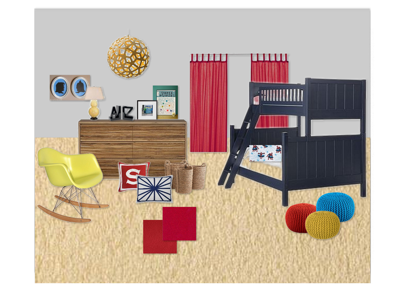
For one of my school projects, we need to design a bedroom. This includes selecting the fabric, furniture, finishes, accessories, etc. I've decided to go with a kid's room because it gives me the opportunity to really play with colour and by selecting my 3 1/2 year-old nephew as "my client", it helps make the selection process a little easier. Obviously, his love of superheroes will play a role and although it won't be a "themed" room it will definitely have a strong influence on colour selection, artwork and accessories.
I've decided to design using the primary colours - red, blue and yellow (triad). In colour theory, it is generally thought that children (after they move out of the black and white baby phase), gravitate towards these bright colours. This is why you'll typically see children's toys in these three colours. It can certainly be a bit garish in one room but with the right tints, tones and shades you can arrive at a sophisticated colour story.
The room has a few features that are more for the grown-ups - a lovely yellow Eames chair, gorgeous David Trubridge coral light and art that doesn't scream comic book store but rather whispers their reference. Of course there is some vintage spiderman on the bed to represent the very cool pillowcases I picked up at Pottery Barn Kids.
It's still a work in-progress but by using Olioboard I can get a good sense for how the room will turn out.
February 25, 2011
Fresh start
2011 may have begun eight weeks ago but I'm still in that "anything is possible this year" mood. I decided to ease into the new year rather than make a lot of changes or resolutions that I knew I wouldn't keep. So far this strategy has worked and each small change, just like little baby steps, has kept me moving forward. Part of my journey this year is to really focus on what I love and that is interior design. To turn this hobby into somthing more, I'm taking classes at George Brown through their continuing ed program and love learning something new every week. I'm currently enrolled in Perspective Drawing for Interiors and spend many hours fighting against my childhood belief that "I can't draw". The truth is that you figure this out pretty early on in elementary school when you're attempting to draw your stick-figure family using a bunch of chewed on crayons. My drawing tools are a little more professional now but there is still that drawer's block (definitely not a real afflication and certainly not English) that I need to overcome This weekend I'll try to master the Lawson grid and create something that resembles a room with a bit of style.
Subscribe to:
Posts (Atom)